Space_Blog_Logo.png
Screen Shot 2018-02-18 at 2.54.47 PM.png

Remodel of Historic Evanston Home

To work in an historic renovation I go into the project with a vision to change what makes sense and with the wisdom to leave the charm of imperfection.

- Deb Reinhart, ASID


The launch of our blog, Space, discusses the interior design of a master bedroom in a delightful turn of the century home north of Chicago.

Falling into Bed

We want our clients to fall asleep!

Space planning is essential for a comfortable bedroom to function within the architecture and how the owner wishes to use the bedroom.

Space Planning Questions:

Will there be television?
Do we need light for reading in bed?
What kind of storage is required for each occupant?

The master bedroom may not be the heart of the home, however it represents the heart of the owner.

- Deb Reinhart, ASID


Master Bedroom Interior Design Plan

The master bedroom, more than any other room in the home, should reflect the owners personality. Our interior design plan of this room includes many layered details creating a one of a kind installation.

Where Did We Start?
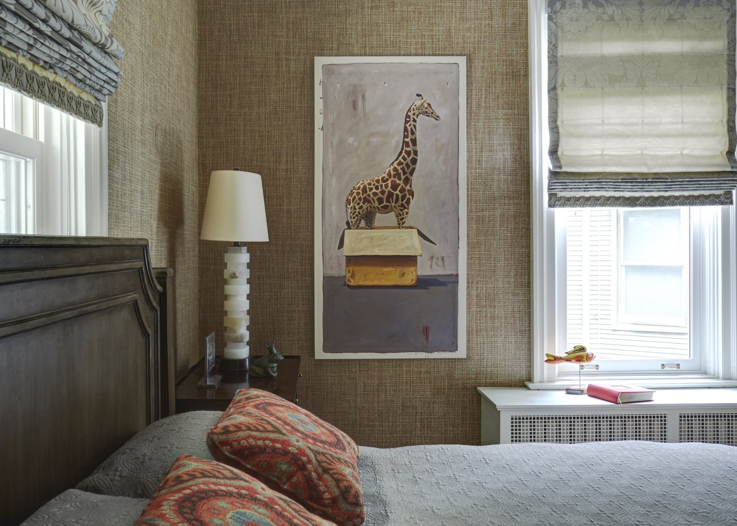
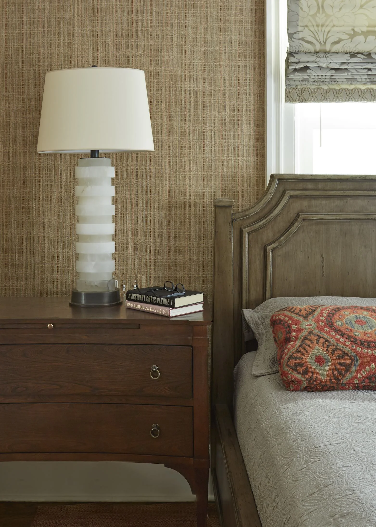
The first decision for the space was an oriental rug, which set the color and tone of the room. The wood floors were left in the original finish which has the same patina throughout the home. With a Tibet rug, rich in colors of red rust and tan, we established the color theme as a basis to select other furnishing.

What Personalizes this Room?
It is our client’s artwork which creates a wonderful statement representing the theme of the family friendly home.

27.jpeg
25a.jpeg

Interior Design: Master Bedroom design in a historic family friendly home renovation in Evanston, IL.

The Master Bedroom is an intimate space - which should nurture the soul for rest and respite from life.” - Deb Reinhart, ASID


Design Elements

Screenshot 2018-11-08 17.51.21.png

The wood bed is finished in a serene deep gray glaze with adjoining night stands in contrasting warm wood. Suite of furniture [all matching furniture from one vendor] is never personal or as visually interesting as the eclectic blend of unique pieces. Each nightstand was chosen as a reflection of his or her own end use or style.

Screenshot 2018-11-08 18.04.54.png

To unify the master bedroom, the walls were covered in a neutral taupe grass cloth which has a subtle red underlay for a pop of color contrasting the gray and taupe colors cocooning the room. Philip Jefferies Wallcovering is our go to resource for quality walls coverings and wonderful design elements spanning their subtle transitional texture to bold contemporary patterns. One of our favorites is the grass cloth which makes a room feel intimate and is acoustically pleasing.

Screenshot 2018-11-08 18.09.19.png

The bed is covered in a gorgeous silk throw, which is wrinkle resistant yet looks both comfortable and luxurious. Our first choice is to resource high quality white sheets for visual comfort and contrast to the decor for a spa like feel. We recommend high thread count Egyptian cotton sheets to provide the ultimate comfort.

Screenshot 2018-11-08 18.12.40.png

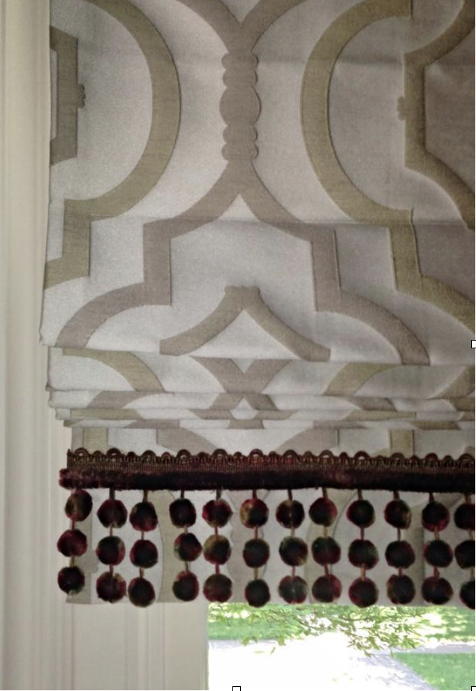
To maximize light for the tall windows, we designed damask roman shades (with custom trim on the hem) to architecturally treat the windows for both privacy and light control. We really love this patented cordless roman shade technology to eliminate the visual clutter of hanging cords on the windows and also provide safety for young children.


Master Bedroom Design Elements

Master Bedroom Design Elements

Sitting Room Design Elements

Sitting Room Design Elements

As an interior designer, my goal is to always respect what comforts the client and works with the space and light.” - Deb Reinhart, ASID

Photographer: Mike Kaskel

Luxury Town Home – For a Man and His Dog

 
Space_Blog_Logo.png
 

Defining Comfort

What does comfort look like? To a sophisticated urban bachelor who divides his time between the worlds of finance, international travel, and outdoor adventuring, comfort looks like a home that reflects his luxurious tastes while being squarely focused on relaxation and refuge.

What does style look like?

It's a space where he can be surrounded by antiques collected during his world travels but where the dog is still welcome on the sofa, a careful mix of hearty materials and luxury details.  It's a home that reflects his lifestyle and his personality.

"This is where Joe can be Joe."

Joes-CS-Interiors-profile1.jpg

Grab the Fall edition of Modern Luxury Interiors for a close-up tour of this Streeterville townhome designed by Deb Reinhart Interior Design Group.

Stay tuned for another great piece of press on a Deb Reinhart project, from the clients needs, the designers challenge to the finish product!

Urban Retreat – Chicago

 
Space_Blog_Logo.png
 

As seen on Open House and published in TCW. ASID Award

"What does comfort look like?" To this jet-setting family, comfort looks like a place to get away without having to head to the airport again, a vacation home in their home town. Comfort was key; this needed to be place you could kick off your shoes after a long week but also luxurious enough to 'wow' out of town guests, and practical enough to stand up to teenage sleepovers.

TCW Image

TCW Image

This project was featured in TCW magazine's June 2013 issue. Check out even more pics from this urban retreat here.

This project was featured in TCW magazine's June 2013 issue. Check out even more pics from this urban retreat here.

What does style look like?

With it's mix of elegant materials, fun pops of color, comfortable upholstered seating , this home reflects both the relaxed yet upscale atmosphere the homeowners desired.  Indian inspired art and accents reference the family's heritage.  It's a home that truly reflects who they are and how they live.

A Home for a World Traveler

 
Space_Blog_Logo.png
 

As seen on Channel 5 Open House and highlighted in Lux Magazine

Get a virtual tour of Joe's man-cave designed by Deb Reinhart Interior Design Group through our feature on Open House or read the full article in Modern Luxury Interiors.

After Photos:

After Photo: Custom Millwork with Red Top Cabinets

After Photo: Custom Millwork with Red Top Cabinets

After Photo: Pool Table Area Converted into Lounge

After Photo: Pool Table Area Converted into Lounge

Our client asked us to design a masculine man-cave to provide more comfort and function. For Joe, this meant highlighting his love of hunting. We took this former pool table room and added a seated bar, TV, and comfortable seating with indoor/outdoor fabric making it dog-friendly.

Before Photos:

Before Photo: Bar Area

Before Photo: Bar Area

Before Photo: Pool Table Area

Before Photo: Pool Table Area

A bedroom was created in the adjoining room and a new lounge allowed for entertaining and relaxation. Our design team (with a skilled general contractor) added a custom bar for seating and in doing so, added more storage and function. We then eliminated the top cabinets for a more open feel.

Indoor Outdoor Fabric – Kid Friendly

 
Space_Blog_Logo.png
 

When presented with the challenge of creating a space that can stand up to the demands of an active family with five children or a bachelor with a love for Labrador retrievers, we don't sweat.

fabrics (1).jpg

At Deb Reinhart Interior Design Group we want the spaces we design to be both stylish and livable. Over the past few years the availability of designer indoor/outdoor fabrics has exploded and the quality has become so great, they're comparable to luxury interior fabrics. Those old stiff coated cottons of the past have been replaced with acrylic fabrics with the look and feel of plush boucle, elegant linen plus tons of on-trend patterns.

6c.jpeg
Living-Room-to-DR-View.jpg

Feel free snuggling up to your pups on this striking sofa... And don't fret if pasta sauce drips on these dining chairs In these living spaces our clients asked for functionality without sacrificing style. We know that thanks to new jacquard weaving techniques, innovative yarns, and advanced finishes durable no longer has to mean utilitarian and chose to upholster these pieces, which are used everyday, with indoor/outdoor velvet.  The quality of these new fabrics is so excellent, no one needs know our little secret.

Earlier this summer our team attended the launch of Holly Hunts new collaboration with Sunbrella, one of the oldest and most trusted names in outdoor fabric. We were wowed by the new collection, especially the loopy boucle Breathe Easy and the plush, almost shaggy Lionheart.

 
cookies1 (1).jpg
 

The line also features classic nautical stripes and geometric patterns in shades of on-trend teals, blues and grays...on fabrics of course, and for this special launch printed on cookies!

Bring Windows to Life – Roman Shades

 
Space_Blog_Logo.png
 

A good dose of pattern is vital to any space. It adds detail and texture and energy to a room, so when choosing fabrics for custom window treatments, we love to pick patterned shades over something solid. Even a subtle tone-on-tone or small-scale pattern on a shade or drapery panel just adds an extra bit of life.  (But you can see, we're not afraid of putting big bright pattern on window treatments!) When installation day finally arrived at the home of these, Evanston interior design clients were so pleased with the difference these shades made in the space. In the living room, the large-scale trellis pattern from Candice Olsen's Kravet line is bold and fresh, while the limited palette of ivory, tan and taupe with a subtle metallic sheen keep it in line with this comfortable yet elegant home.

A row of burgundy silk pom-poms is and fun, unexpected addition that ties it into the rich reddish accents through out the space.

Screenshot 2018-11-08 19.04.37.png
Screenshot 2018-11-08 19.05.01.png

Since the dining room is across the hall and the home has an open plan, we used a similar style roman shade and color palette but this time chose a smaller scale pattern, a woven honeycomb in metallic taupe and two rows of wood teardrop beads...a more sophisticated, but no less unique, look for this formal space.

Trade Secrets – For How to Design Ceilings, The 5th Wall

 
Space_Blog_Logo.png
 

Poor old ceilings. They're so often neglected in the design of a room.  There's no quicker way to take a space from "Oh, that's pretty" to "Wow!" than to add detail to the ceiling. After all, it is the 5th wall of any room! 

Let's take a trip back in time and look at some pics of this Chicago condo (whose powder room was featured on the blog last week) before we got our hands on it.


It's a great space... a big fireplace focal point, tall windows looking out onto the Chicago River, and thirteen foot ceilings.

DSC05644.jpg
005-2.jpg
DSC03607.jpg

Everyone loves high ceilings. It's open and airy and grand, no doubt there. But there are challenges when dealing with all that height. The large volume of empty space created by high ceilings can dwarf furnishings and just feel cavernous. Add to that the special challenges of this room...the small footprint which made that  height feel out of balance, and the raised dining room and kitchen to the left, whose view of the river ran right through the vast emptiness above the living room, and we knew we needed to address the ceiling.

We began by building out a rectangular soffit, mirroring the shape of the room and defining the living area from the rest of the open plan first floor.

1001-copy.jpg
1269996945highrise4foyer.jpg

Already, it's looking better.

Since the goal was a warm, textured room full of art and artifacts and beautiful details, additional detail was needed to bring the ceiling up to snuff. Four beautiful wood panels were installed in the soffit with recessed lighting glowing softly behind and can lights around the perimeter for flexibility.

Now the rich wood draws the eye up and pulls the "5th wall" down, allowing it to become a part of the composed space. As Deb said, "We could've fill this room with treasures and you would never know. They'd be swallowed up."

Now the ceiling itself is a treasure.


Let's peek into the kitchen of our luxury Chicago bachelor pad.  We're focusing on the ceiling. We chose to replace the hood with an updraft (which can do the job just as well and, in this home of a bachelor with little interest in cooking, the 'gourmet kitchen' didn't fit with his lifestyle) surrounded by a soffit and inset lighting that shows off this beautiful antique carved panel.

Before

Before

After

After

After

After

Just like a chandelier over a dining table, this panel grounds the space...The detail of this soffit with an antique screen- creates a more intimate feeling space, a special nook rather than just kitchen overflow.

Remodeling Bathrooms – Interior Design Tip

 
Space_Blog_Logo.png
 
Before

Before

After

After

Earlier this year, one of our long-standing Chicago clients came to us with a challenge… Replace this boring builder grade vanity with something special, something that added character and personality to this small powder room. But there was a catch. Don't mess with the wallpaper. The homeowner had added it years ago and still loved it, so no cutting open the walls for plumbing or electrical, and no mill work that would mess with the walls in any way.

Oh, and also, can you do it ASAP? Instead of building custom cabinetry (too time-consuming and would likely damage the walls) or plopping in a new vanity (too bland, too expected), we took our cues from the homeowner's style and the rooms we had worked on together in the past, which have a pronounced Asian influence, as well as extensive use of antiques.

The solution was found at one of our favorite retailers, Golden Triangle, a Chicago-based boutique specializing in Asian artifacts, antiques and architectural salvage.

This early 1800's carved Yang wood chest from the Shanxi Province of China had the look we wanted but, at 47 inches wide, was just too big for the space.  However with a few careful cuts eliminating the overhang of the top, we were able to get it down to the perfect width and slide it right in.

Swap the glass vessel sink with this brass piece with a rich finish that will age over time, a great match for the antique finish of the vanity, and this bathroom is a true beauty.

rsz_1vanity3.jpg

From run-of the mill to one of a kind! Stay tuned for updates on this awesome space. Our next challenge...the top to bottom re-design of the media room incorporating a huge (and already installed) wall-mounted TV and audio system. We have our thinking caps on for this one.

Another clients project-Powder room in a high rise

Antique chest-bronze vessel sink and venetian plaster wall covering transform a high rise powder room.

Received Best of Houzz award

Screenshot 2018-11-12 18.19.13.png
Screenshot 2018-11-08 19.30.44.png

Turkey – Excavations Reveal Interior Design from AD

 
Space_Blog_Logo.png
 
3286496.jpg
Screenshot 2018-11-08 19.36.54.png

 On a recent cruise to Italy, Greece and Turkey, I was struck by not only the unbelievable beauty of the Mediterranean scenery and incredible architecture, but also by just how much we have taken from the innovations of the people who lived there thousands of years ago.

Ephesus, Turkey.  I was amazed by the beauty of the frescoes and the incredible embellishments these ancient people put into their homes.  These paintings are so expressive, colorful, and festive.  What is fascinating is that in some areas, chipping paint reveals other frescoes underneath the outer paintings. We know that even primitive man would carve and paint drawings on to cave walls, perhaps as decoration, perhaps as a way of recording history (or both).  It is interesting to think about people thousands of years ago and how similar they are two modern man.  Even then, the fashion in home decor changed and the people who could afford to remodel changed their homes according to the latest design trends.

1090011254_34e4a0fccf.jpg
xti_4353p.jpg
ephesus_house_on_slope.jpg
Screenshot 2018-11-08 19.40.11.png